
Bridge
Art Direction
Brand Identity
UX / UI design
Motion Graphics
Intro
Bridge approached us after launching its first version in the App Store, with a clear product idea, but a brand and interface that didn’t resonate. The challenge was to rethink both identity and UX from the ground up, and help position the app as something users would trust and actually use.
Work
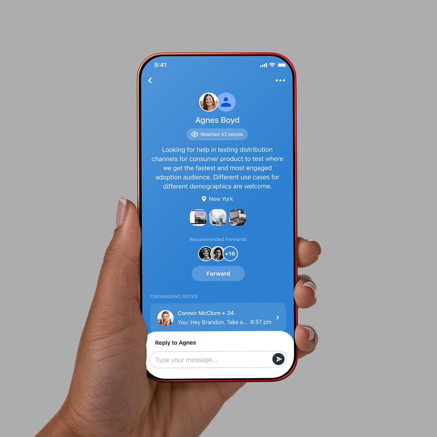
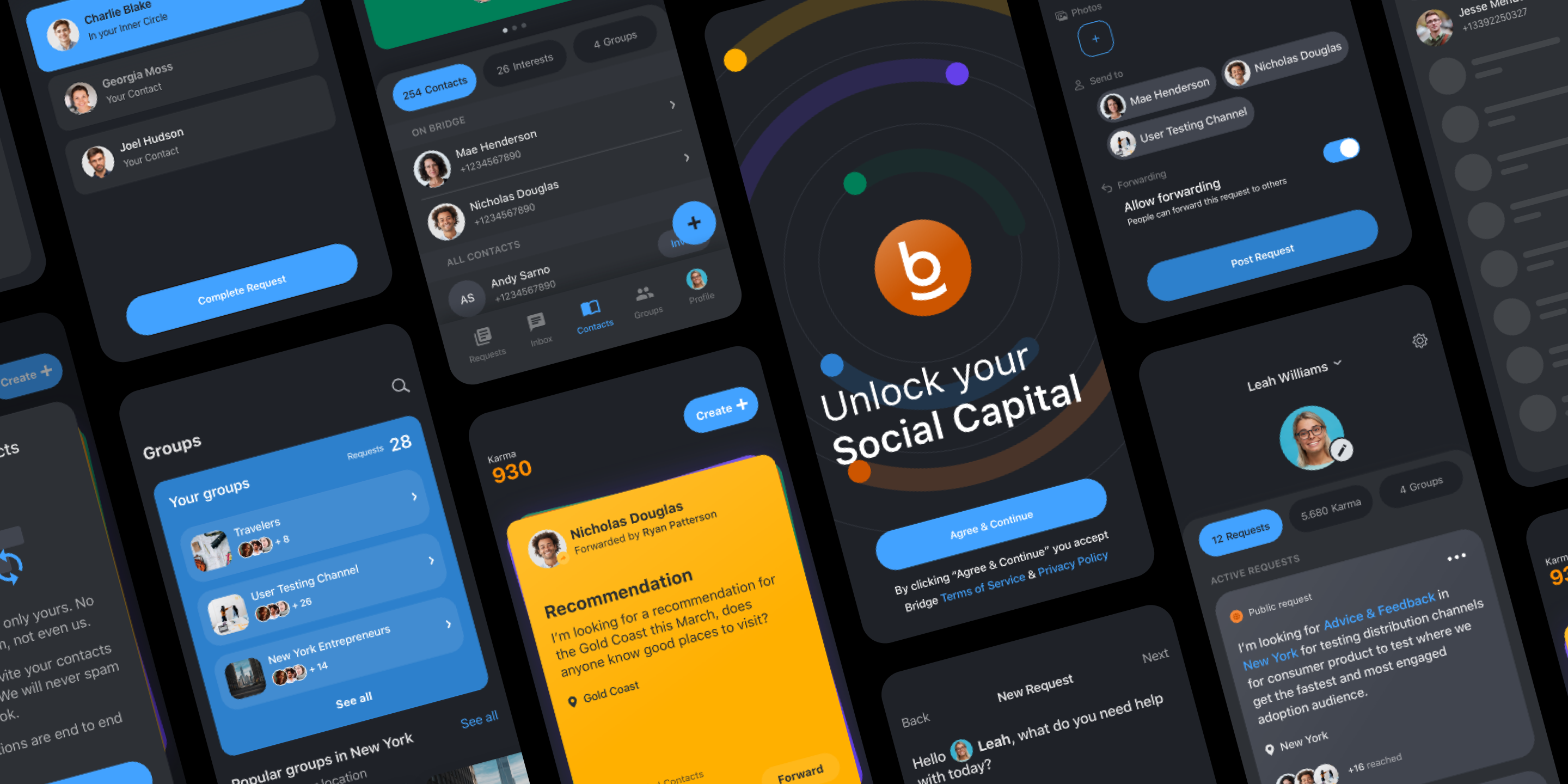
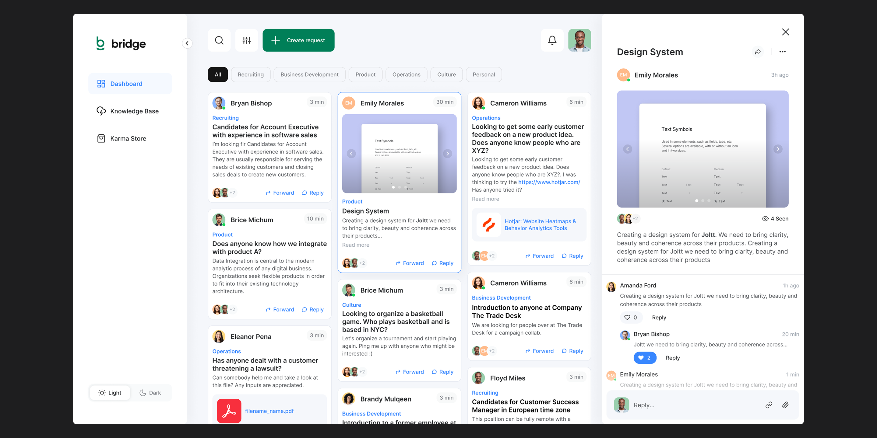
Our work included a comprehensive rebrand and complete redesign of the iOS and web apps, encompassing design systems, UX strategy, and UI design. We supported the team with audience research that led to a major pivot: shifting their focus from individuals to companies, which early adopters quickly embraced.

Results
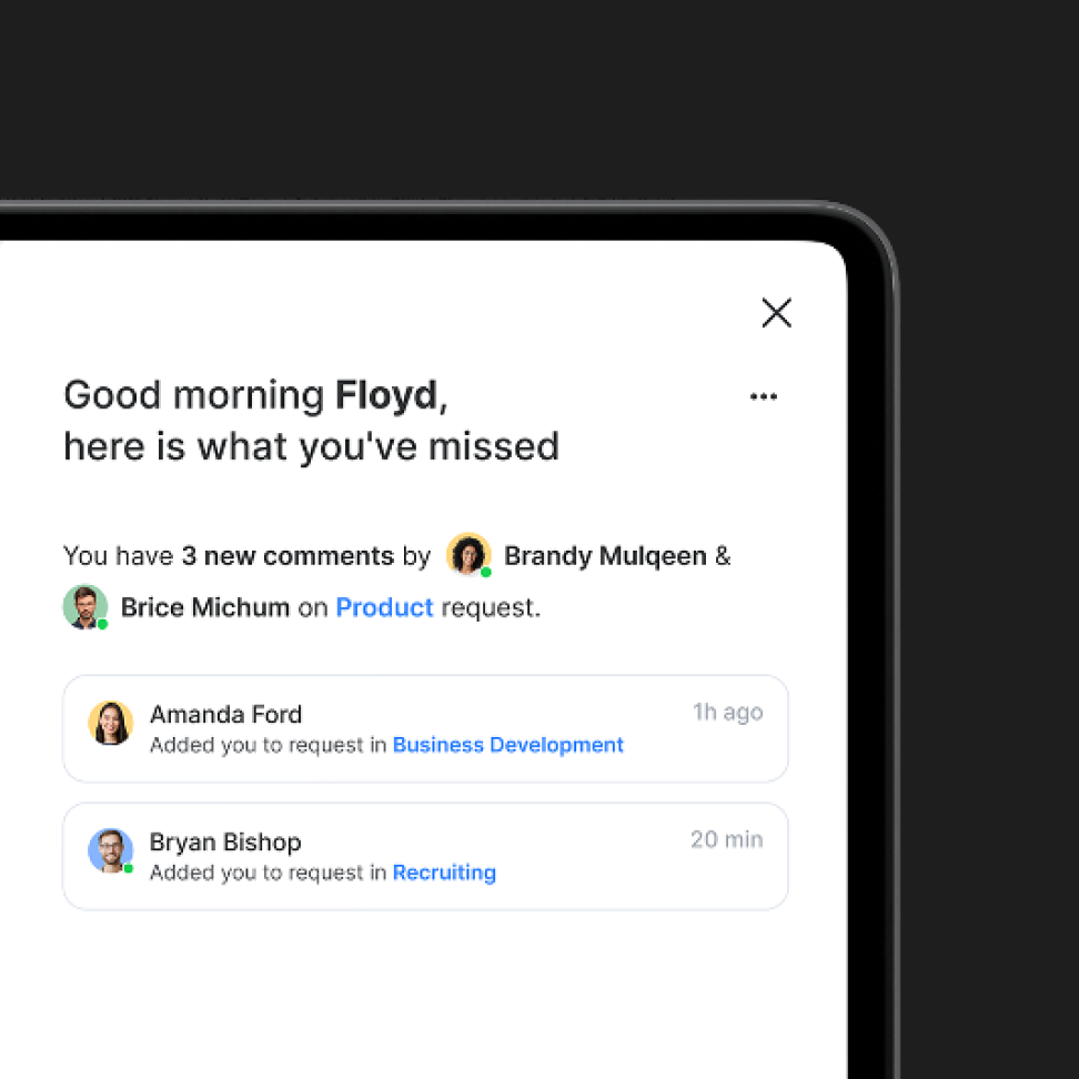
The result was an interface that simplifies complex social interactions, while staying warm, open, and human. Bridge now feels like what it was always meant to be - a modern, intuitive way to ask for help and build trust.

Identity
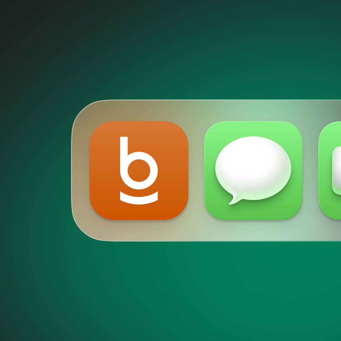
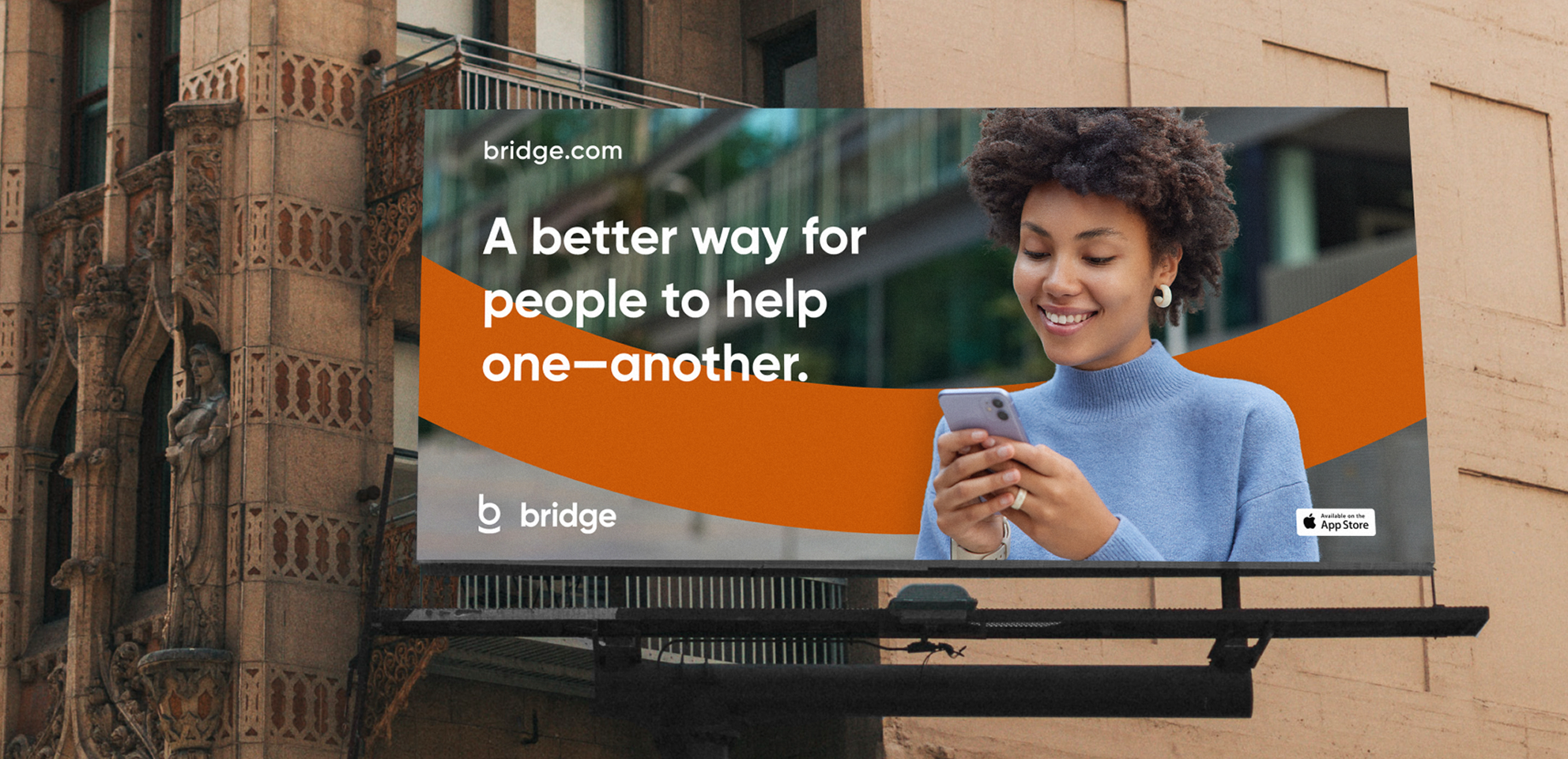
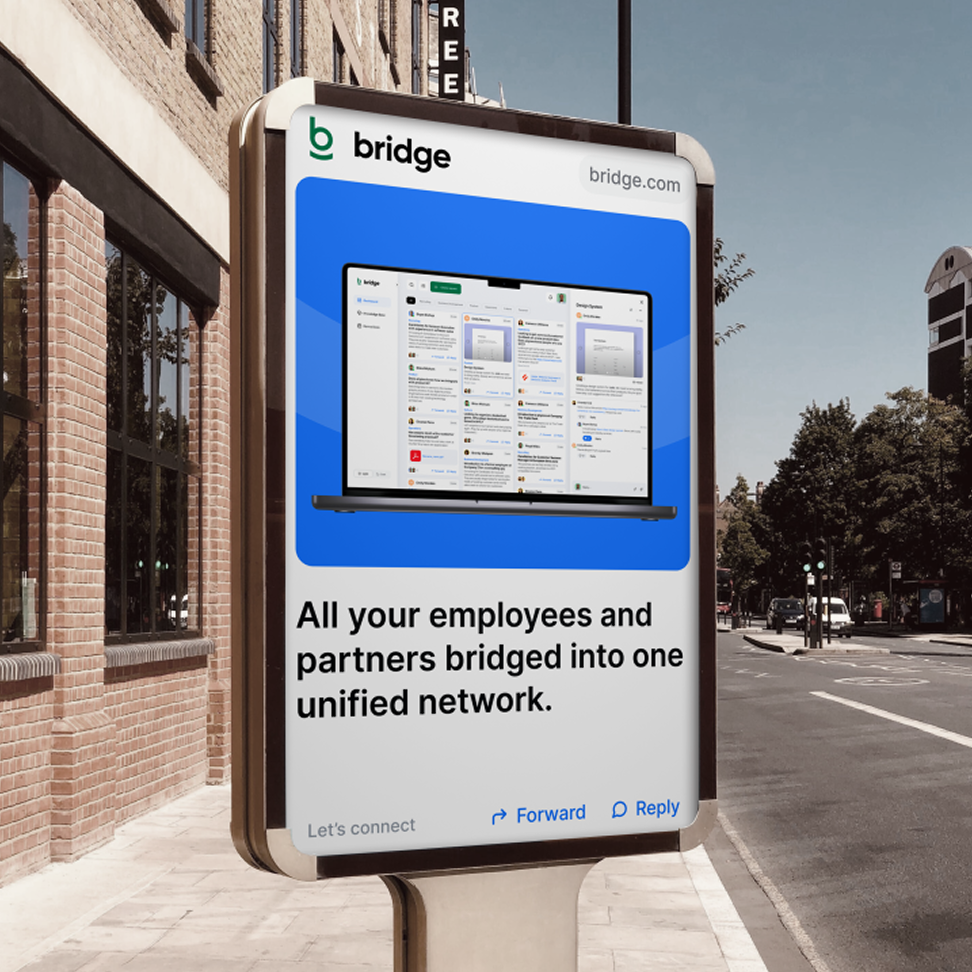
Created a new brand system with logo, typography, and color built to feel friendly, modern, and trustworthy across digital and physical platforms.
Product
Redesigned both the mobile and web experience - with a clear UX flow, flexible UI components, and a tone that reflects human connection.
Insight
Provided market research and positioning support that helped Bridge refocus its offering toward organizations, unlocking new growth potential.


Natura Eco

