
Amobee
Art Direction
Brand Identity
Motion Graphics
Activation Campaigns
Research and Strategy
Intro
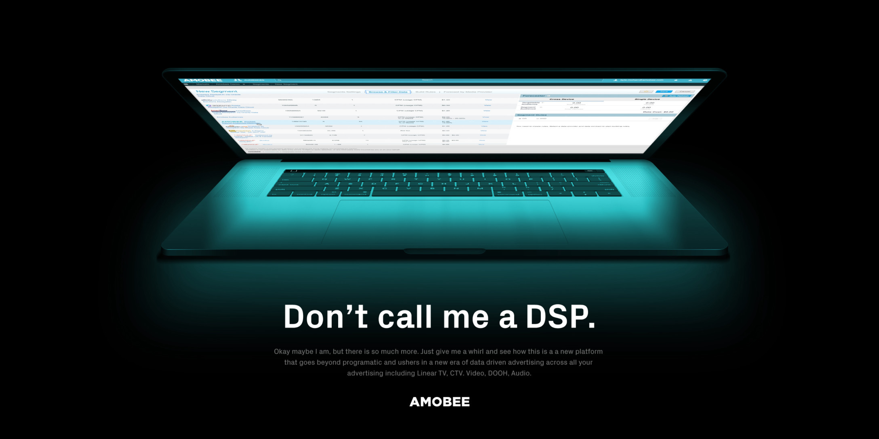
Amobee needed to shift perception. After a series of acquisitions, the brand found itself in a sea of sameness - yet its product offered much more: a powerful, end-to-end platform for advertising across every screen.
Work
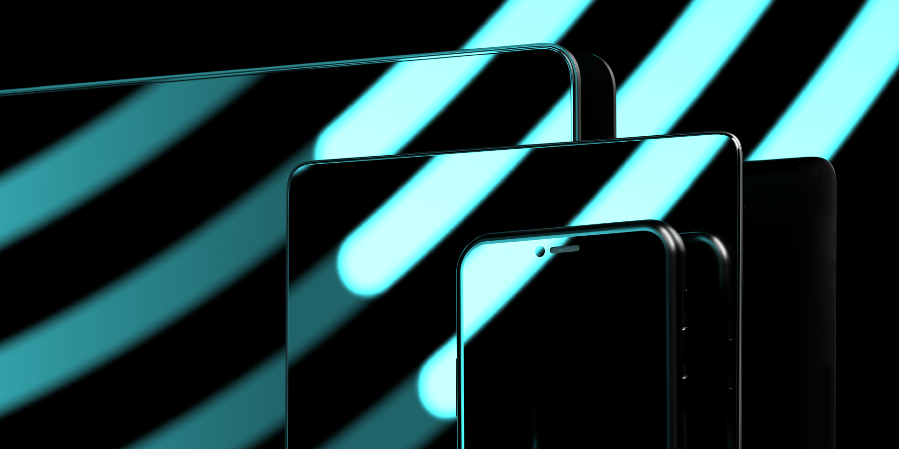
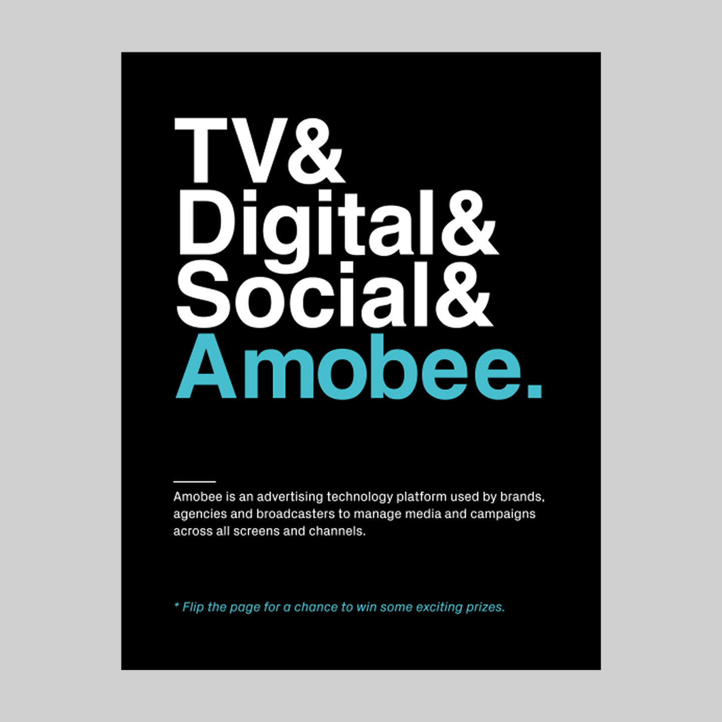
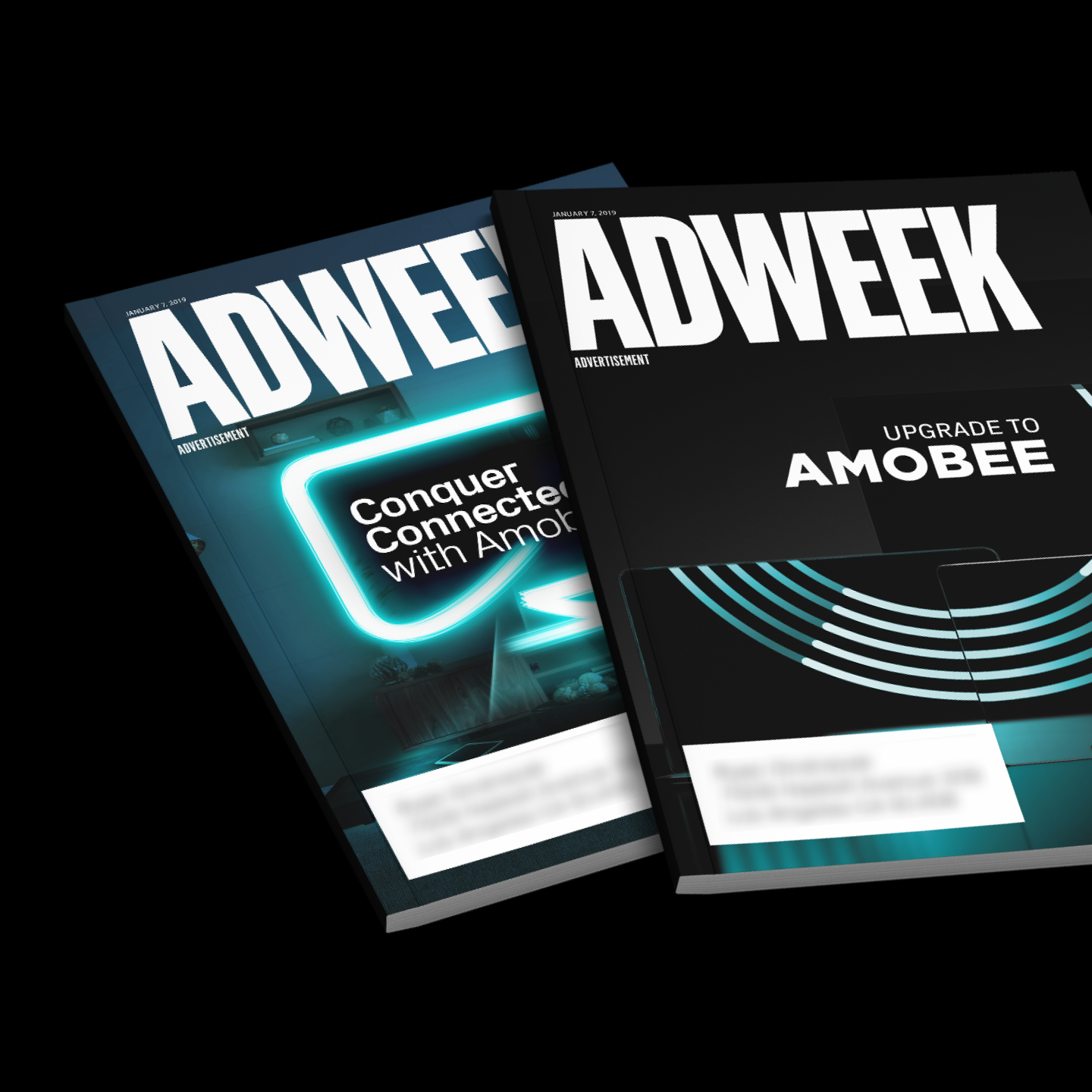
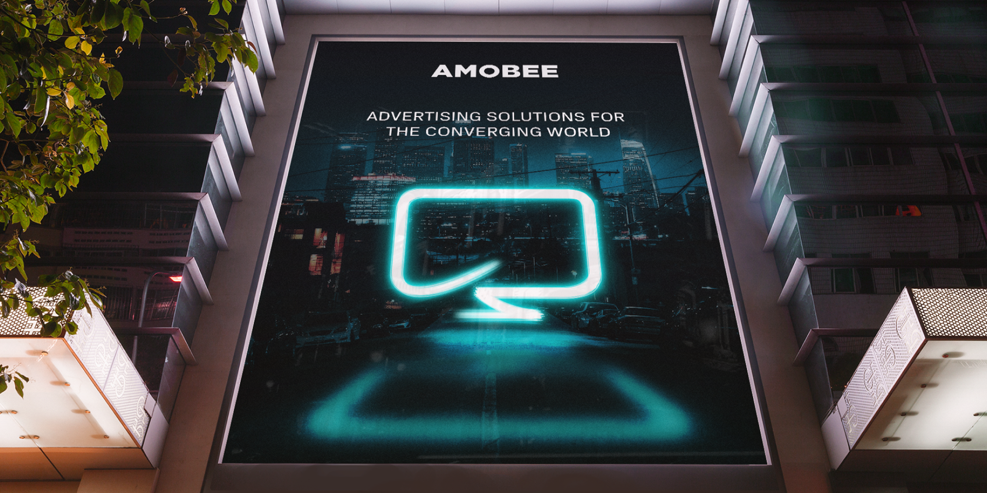
blck.studio worked closely with their team to reshape how the brand shows up - in motion, print, and physical space. From Cannes to CES, we developed a visual language built on bold design systems, custom iconography, and campaign visuals that clearly communicated convergence across mobile, desktop, tablet, and TV.

Results
Our brand overhaul helped reposition Amobee as a true cross-screen leader, with recognition from Gartner and Forrester, a 15% year-over-year sales lift, and a successful acquisition soon after.

Convergence
Developed core assets and messaging that represented Amobee’s platform convergence across mobile, desktop, TV, and tablet - launched at Cannes and carried through global activations.
Identity
Defined a bold, tech-forward visual language using light forms, iconography, and motion - applied consistently across digital, print, OOH, and events.
Loyalty
Partnered with Amobee for 5+ years. Supporting product marketing, event rollouts, webinars, and print campaigns as the brand continued to evolve.

Bridge

